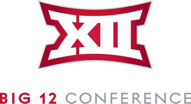
The Big 12 officially unveiled its new logo on Monday, marking the beginning of the rebranding of the conference.
The new look steps away from the traditional roman numeral feel, but still uses the roman numerals as the basis for the graphic.
Additionally, each of the 10 schools in the conference will be able to use the logo in the colors of the athletic programs.
And the logo is just one part of the rebranding of the conference, including the renovated website big12sports.com.


